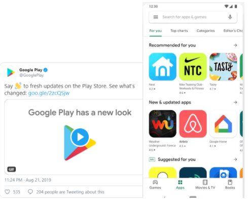
Google has been rolling out a series of Material Theme redesigns over the past few months. We’ve already seen changes for Gmail for Android and Google Drive. Next up is Google Play, one of the largest app stores home to more than 2 million mobile apps. So what exactly is changing?
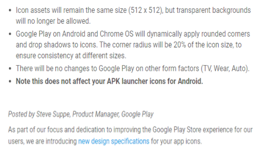
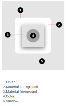
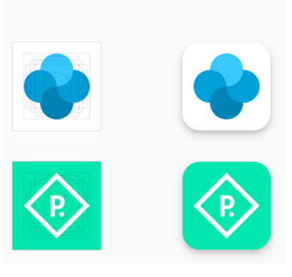
Product icons are the visual expression of a brand and product, including their services and tools. Icons communicate the core idea and intent of a product in a simple, bold, and friendly way. While each icon is visually distinct, all product icons for a brand should be unified through concept and execution.Google has decided to enforce this app redesign in order to bring uniformity among Google products. Until now, the app icons on Google play store had free range - hence messy. The new icons will be in the shape of square+circle= sqircle!
Below are the guidelines you should follow when creating assets for your app’s listing on Google Play-
Specs
Source: Google
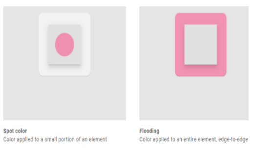
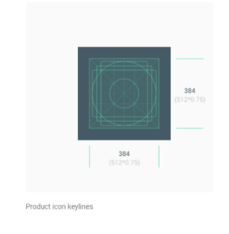
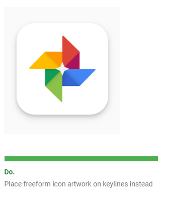
Uniformed shapes are more appealing and easier to understand . This helps users focus on the artwork rather than to the shape! You can use the entire space to show your artwork or you can design and position artwork elements such as logos onto the keyline grid. When placing your artwork, use keylines as a guideline, not a hard rule.
When creating your artwork, ensure it conforms to the following:
- Final size: 512px x 512px
- Format: 32-bit PNG
- Color space: sRGB
- Max file size: 1024KB
- Shape: Full square – Google Play dynamically handles masking. Radius will be equivalent to 20% of icon size.
- Shadow: None – Google Play dynamically handles shadows. See ‘Shadows’ section below on including shadows within your artwork.
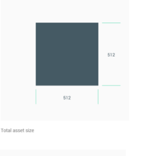
Once the app icon is uploaded, Google Play applies the rounded edges features and adds shadow in order to maintain uniformity among all the other app icons.
Sizing
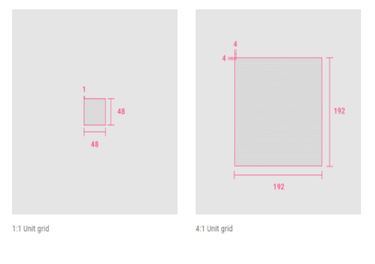
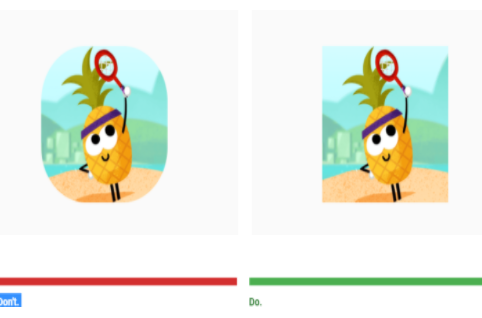
Utilize the full space when dealing with minimalistic artwork. Use the keylines asd guide for positioning your artwork.When creating an icon, view and edit it at 400% (192 x 192 dp), which will display edges at 4dp. By maintaining this ratio, any changes to the original will be scaled up or down proportionally, which preserves sharp edges and correct alignment when the scale is returned to 100% (48dp).
Lighting
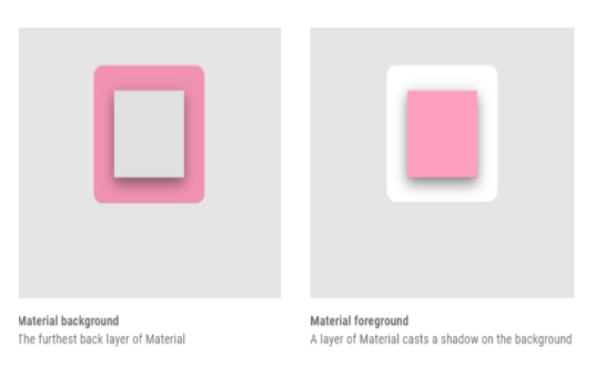
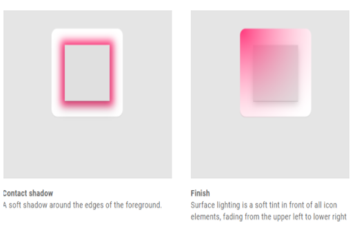
In a material environment, virtual lights illuminate the scene and hence cast shadows. Light is cast on top of the elements , creating a shadow that highlights the app icons top and bottom edges. When adding shadows , consider consistency with the Android platform by following the guidelines.
Drop shadow metrics
Mode: Normal
Opacity: 20%
X Offset: 4dp
Y Offset: 4dp
Blur: 4dp
Color: Refer to Tint, shade and shadow values
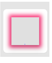
Corner radius
Google Play dynamically applies corner radius. This ensures consistency when the icon is resized across different UI layouts. Radius will be equivalent to 20% of icon size.
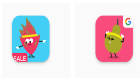
Embedded badges
Embedded badges make your artwork look awful. Stay away from promoting any kind of promotions or adding any badges on your artwork.
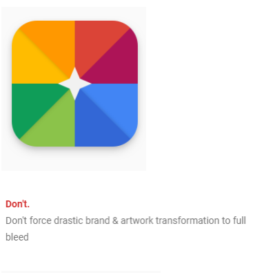
If shapes are a critical part of your logo,don’t force your artwork to bleed into full space. Instead use the new keyline grid wisely.
Pick a background color that is appropriate for your brand and does not include transparency.
Incase no shape or distinct logo is critical to your app artwork, then you can let your artwork bleed into the entire space available.
If your artwork for the logo is flexible enough,you could also consider experimenting with it.
As per Google play announcements, original icons that have not been updated per the new specifications will eventually be migrated to legacy mode and scaled down 75% to the keyline grid size (512 * 0.75 = 384px).