Imagine you opened your app store or your google play store and quickly typed the keywords in the search bar, quickly scanning through the range of apps available on both the stores, before deciding whether to download any or not. What caught your eye and made you download a certain app?
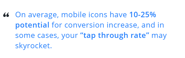
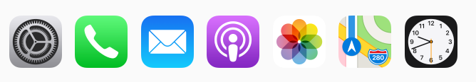
Considering the fact that the human brain processes visual information much faster than text, the way your app looks should be the governing factor for your ASO(app store optimization). The app store icon is not only the face of the app, but also the face of the brand.
What is ASO?
App store optimization is the method of optimising the mobile apps to rank higher in an app store search result. The higher the app ranks in the app store search, the better it attracts potential clients .
With plenty of mobile applications available on both Android and IOS platforms, the customers are bombarded with many choices whether to download an app or not. Users spend very less time to decide if they want to try your app or not and their deciding factor is mostly influenced by the first visual impression from your app.
However, just vaguely having an awesome graphic app icon doesn’t necessarily mean that it will lead to increased download. A pioneering app icon will aid in getting interested users to explore your app in more depth, read your app description and screenshots and hopefully actually download and begin using it!
Why is ASO important for app?
According to the recent data, Android users are able to choose between 2.7 million apps available to download and iOS users have around 1.85 million apps to choose which means that your app is likely to have a tough competition. Therefore the primary goal of ASO is to increase the popularity of your app and increase in the number of customers. In order to understand how to increase or boost your app visibility, it is important to understand how people are searching apps or looking for in apps.
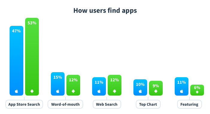
Most users are on the lookout for specific apps on Google Play Store and Apple Play Store. A whopping 70% of mobile users utilize search to find new apps. Furthermore, 65% of all downloads occur directly after a search. Clearly, app store search is the most common method for discovering new apps.
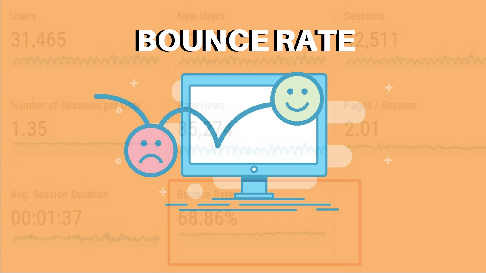
The higher the download of your app, the higher is your ranking on the app store. That’s why achieving a top rank is crucial to app success. Without App Store Optimization, you are missing out on the largest marketing channel for mobile apps and games.
Benefits of app store optimization
Improved visibility in the app store.
Getting discovered by high quality and relevant users.
Increase downloads in a sustainable way by regularly monitoring your app.
Increasing app revenue by monetizing your app and including in-app ads, in-app purchases, and subscription models. As a result many of you may decide to run ads to bring in more users and thus, more revenue.
Reaching global audiences by localizing your app.
How app store optimization work
Once your app is developed and you are familiar with the basics of app marketing, you have to decide where to publish your app or mobile game- Google play store or Apple store.With the frequent use of mobile phones, the app industry started booming. In this manner, the Apple App Store saw an increase in the number of apps from 800 since its launch in 2008 to 2.2 million in 2019 (Source Business of Apps ). Similarly, the number of apps available on Google Play has reached 3,6 million in March 2018. It is clear that the competition on the market is strong. As the number of apps have increased, both Google and Apple have become selective in allowing apps to be published in their platform. Apps with high crash rate, infrequent app updates, lower quality or scammy apps are the one’s to get instantly removed from the platforms.
Let’s take a look at the two major app stores in more detail.
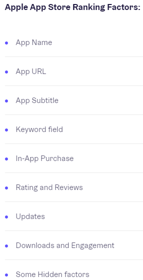
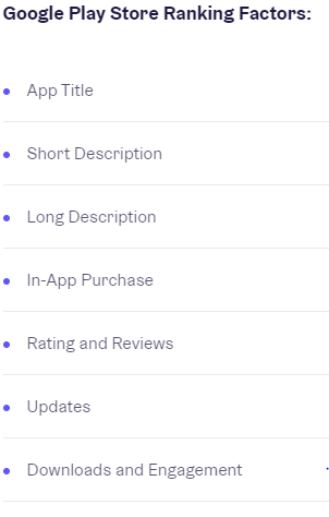
One of the key differences between the Apple and Google Play store is their publishing aspect. Both the companies have selected an app review process in order to maintain a high quality of app available to their customers. However, Apple’s review process tends to take longer than Google’s. Usually a 3 day buffer is taken into account whilst releasing an app and once approved it becomes live on Apple and Google Play Store within 24 hours. Although keywords are essential for ASO in both stores, they are evaluated differently.Google considers all textual elements when indexing keywords for your app. You’ll also want to repeat keywords 3-5 times across all fields in order to rank for them. The Apple App Store, on the other hand, provides a specific field for your keywords.
Source App Radar
How is app store optimization done
Establish a clear ASO strategy- It is crucial to know your market and understand your users so that you can use it to improvise your app. Find out the keywords they are using, the language they are speaking
Pick the right app name- It is important to choose your app wisely and find a name that is relevant to your app, appealing , unique and easy to read for users. Currently, you have 50 characters available in the Google Play Store and 30 characters in the Apple App Store.In addition, the keywords in app name have the strongest ranking weight .
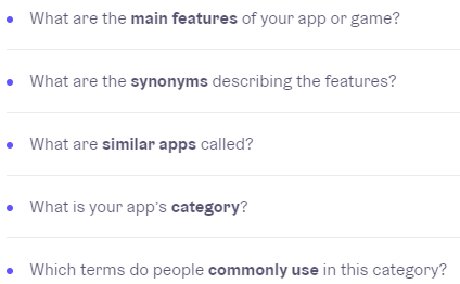
Know how to do keyword research- The keyword is the word used by the potential customers to search for apps. The goal is to establish the keyword with which you want your app to be found. When doing your keyword research, consider the following:-
Writing your app description - The app description provides your users with a brief description or overview of your app along with its main features. The description is one of the main features where Google finds the keywords to rank your app for. Apple does not index keywords from your iOS app description. Description is limited to 4000 characters in both the stores.
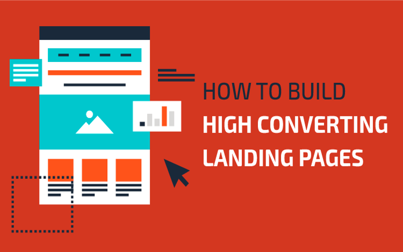
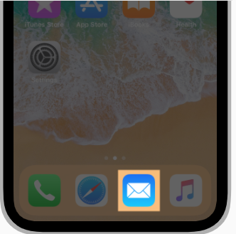
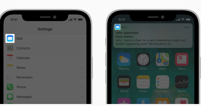
Choosing the right app icon- App icon is one of the main reasons that grabs the attention of the potential customers. Therefore, it is deemed as another crucial element of App Store Optimization. When designing your app, think what your app is about and how would it convey the same visually to the users. A great way to test which icon would be perfect to represent your brand is by A/B testing- create more variations of your icon and find which one gets most clicks!
Requirements for app store icon sizes
No matter how well though your app might be, it has to meet certain technical specifications. Let us take a look at these for Google and Apple platforms. Every app needs a beautiful icon that captures the attention of the user in the App store and also stands out in the home screen.
Here’s the App Store icons size table for different Apple devices:
| Device or Context | Icon Size |
| iPhone | 180px × 180px (60pt × 60pt @3x)120px × 120px (60pt × 60pt @2x) |
| iPad Pro | 167px × 167px (83.5pt × 83.5pt @2x) |
| iPad, iPad mini | 152px × 152px (76pt × 76pt @2x) |
| App Store | 1024px × 1024px (1024pt × 1024pt @1x) |
App Icon Attributes
All app icons should adhere to the following specifications.
| Attribute | Value |
| Format | PNG |
| Color space | sRGB or P3 (see Color Management) |
| Layers | Flattened with no transparency |
| Resolution | Varies (see Image Size and Resolution |
| Device | Spotlight icon size |
| iPhone | 120px × 120px (40pt × 40pt @3x) |
| 80px × 80px (40pt × 40pt @2x) | |
| iPad Pro, iPad, iPad mini | 80px × 80px (40pt × 40pt @2x) |
| Device | Settings icon size |
| iPhone | 87px × 87px (29pt × 29pt @3x) |
| 58px × 58px (29pt × 29pt @2x) | |
| iPad Pro, iPad, iPad mini | 58px × 58px (29pt × 29pt @2x) |
| Device | Notification icon size |
| iPhone | 60px × 60px (20pt × 20pt @3x) |
| 40px × 40px (20pt × 20pt @2x) | |
| iPad Pro, iPad, iPad mini | 40px × 40px (20pt × 20pt @2x) |
Here’s the Google Play Store icons size table for different Android devices:
- 32-bit PNG (with alpha)
- Dimensions: 512px by 512px
- Maximum file size: 1024KB
Both Google and Apple play stores have different requirements and recommendations for mobile app icon
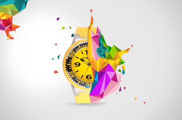
Make it unique, so it stands out
It is important for your users to understand the necessity of your app- there should be a story or a message behind your mobile apps. Let’s take an example of the illustration below. What does it represent? If we look at selfie cam apps, the majority of apps show similar camera icons. This is essential to connect the users to the usability of this app.
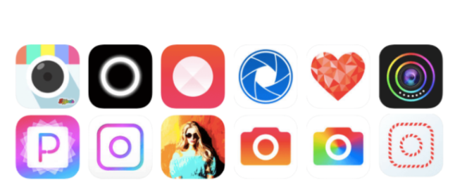
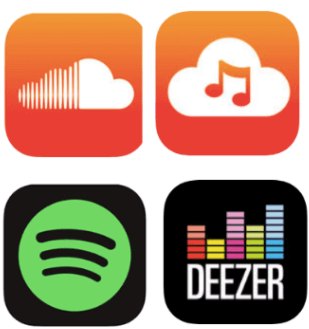
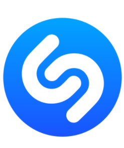
Let’s take another example. Music apps contain graphics like musical notes, sound waves and equalizers.
Testing with colors and styles of mobile cons
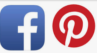
When you are creating an app, you also need to keep in mind - who is it targeted at- gender, age group, location and language of the users. Most companies are recognised by colors, so are the apps. Let’s use an example: Blue is a popular color with many big companies (Facebook, Twitter, Visa, etc.). It has literally become a representation of trust, honesty, loyalty, security, and tranquility. This color is often used on logos and icons of the products intended for international use as it hasn’t got any negative cultural interpretations.
Green is mainly associated with money and nature.
Purple is more of a feminine color. Red is bold and energetic, orange is cheerful and yellow is warm. You can pick red for a sports app.


Keep your app icon simple
Keep the number of graphical elements to a minimum.1024 × 1024-pixel canvas is a challenge in itself. So try the design out on the device in multiple contexts and sizes. Make sure your mobile icons look good against a variety of backgrounds.
Logo or no Logo
While Logo and mobile icons have some similarities but they also have many dissimilarity.The approach, the tools, and the process of creating these images are absolutely different and so are their success criteria. If you still believe that your logo can become a mobile icon be sure to test it.
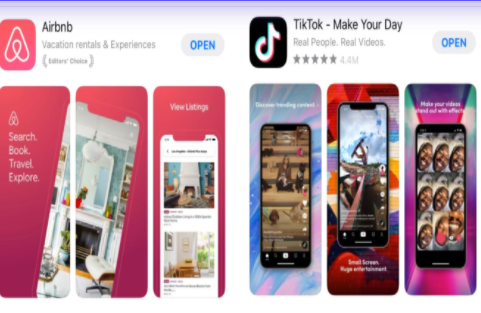
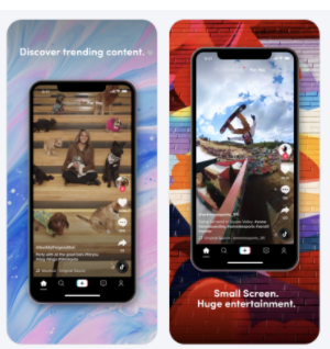
Prepare app screenshots and video- Screenshots and videos may not play a direct role in influencing your customers to download your app, but plays a significant role in conversion rate optimization. App screenshots tell the customers a story. It allows them to sneak peek into your app, before downloading it. App store gives you 10 slots, while Google gives you 8. The best way to use this space is to - create a storyline with the screenshot and aim for a cohesive story with each slot. The first screenshot is most important, as you want to highlight your main and appealing feature here.
App listing and localization- Now that your app icon and screenshot is sorted, let’s move to the next step. What language have you made your app in? English?. Well, if you want your app or game app to be available to a global user base, it’s time to localize your app. Sounds quite a task? Well you don’t have to start from the scratch. You can use your existing metadata, keywords or screenshots and translate them into other languages.
App reviews and rating- Feedback from your users is an integral part of ASO. Both Apple and Google play store take into account the reviews left by the users on your app. The better the rating, the more relevant the app is to the users. According to some independent tech research about 80% of the users check atleast one app review before downloading it.
Managing your app in an efficient way
One must regularly keep a track of their apps performance. Keeping an eye on the app analytics can help you improvise on more downloads, therefore bringing in more revenue. Apps analytics can help you improvise on your apps strengths and weaknesses. Analyzing apps analytics could be very hectic so we listed few tools for you-
AppRadar- ASO tool for Android and iOS apps. The best thing about AppRadar is that it supports you through the whole app store optimization process. Powered by Artificial Intelligence , its clean interface provides features that saves your time.
Appsflyer- Platform specialising in mobile It is a SDK (Software Development Kit) available for iPhone, Android and Windows Phone apps. Once it it is installed, this allows you to find out where your downloads come from and which sources are the most profitable for your app.
Grow your apps with less effort
Therefore, App Store Icon provides users with a first impression of an app before they even click on its page. Whether the app appears as a featured app, in searches or in a category list, users will see the icon. This makes the icon an important creative asset for every app.